
Rulantica
In 2019 Rulantica opened it’s doors, a new immersive indoor waterpark. Themed after a discovered Island called ‘Rulantica’ with different areas in the “land".
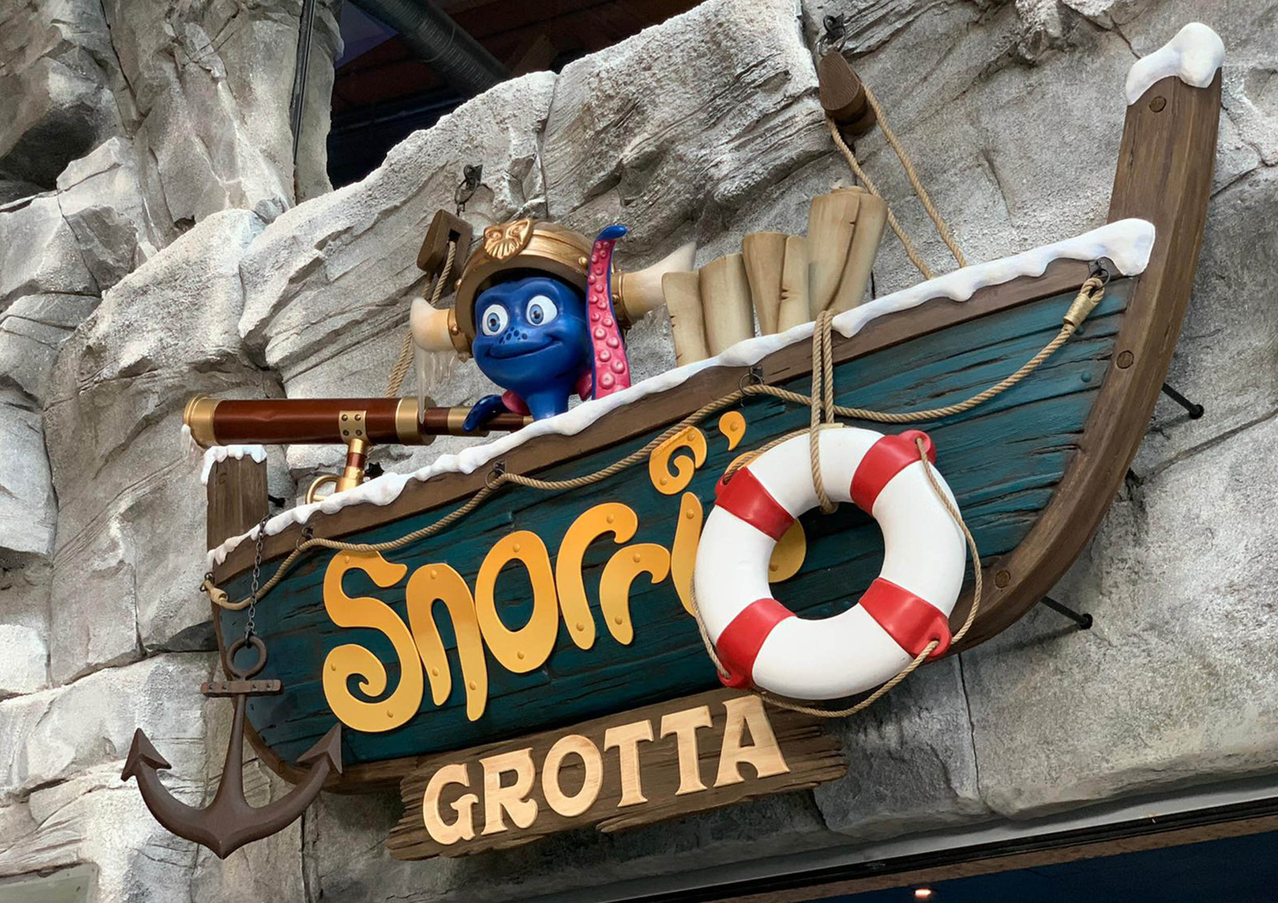
A Viking harbour town, a Mermaid grotto, an ice palace, a shipwreck beach and a Troll forest are among the areas to discover. Fantasy blended with Scandinavian inspired architecture. All tied together by a mascotte called ‘Snorri’ an octopus with a distinct character.
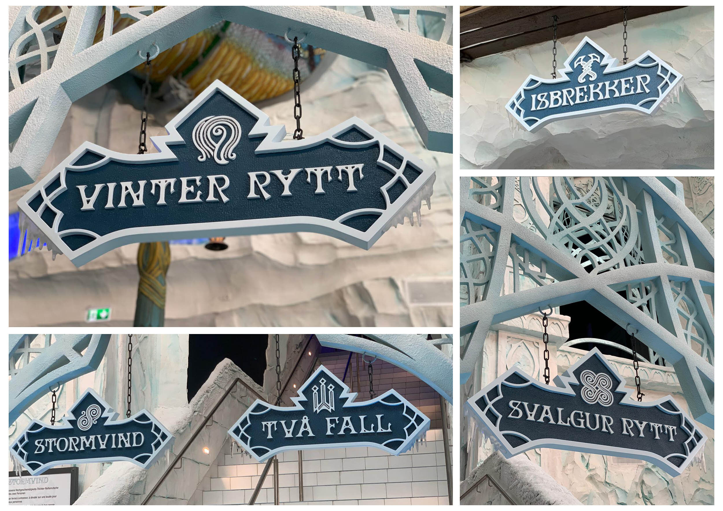
To really make the atmosphere and feel of discovery and adventure match together, I did extensive research on materials, colors, building techniques and symbols used in a time such as the vikings to make the signage feel as authentic as possible.
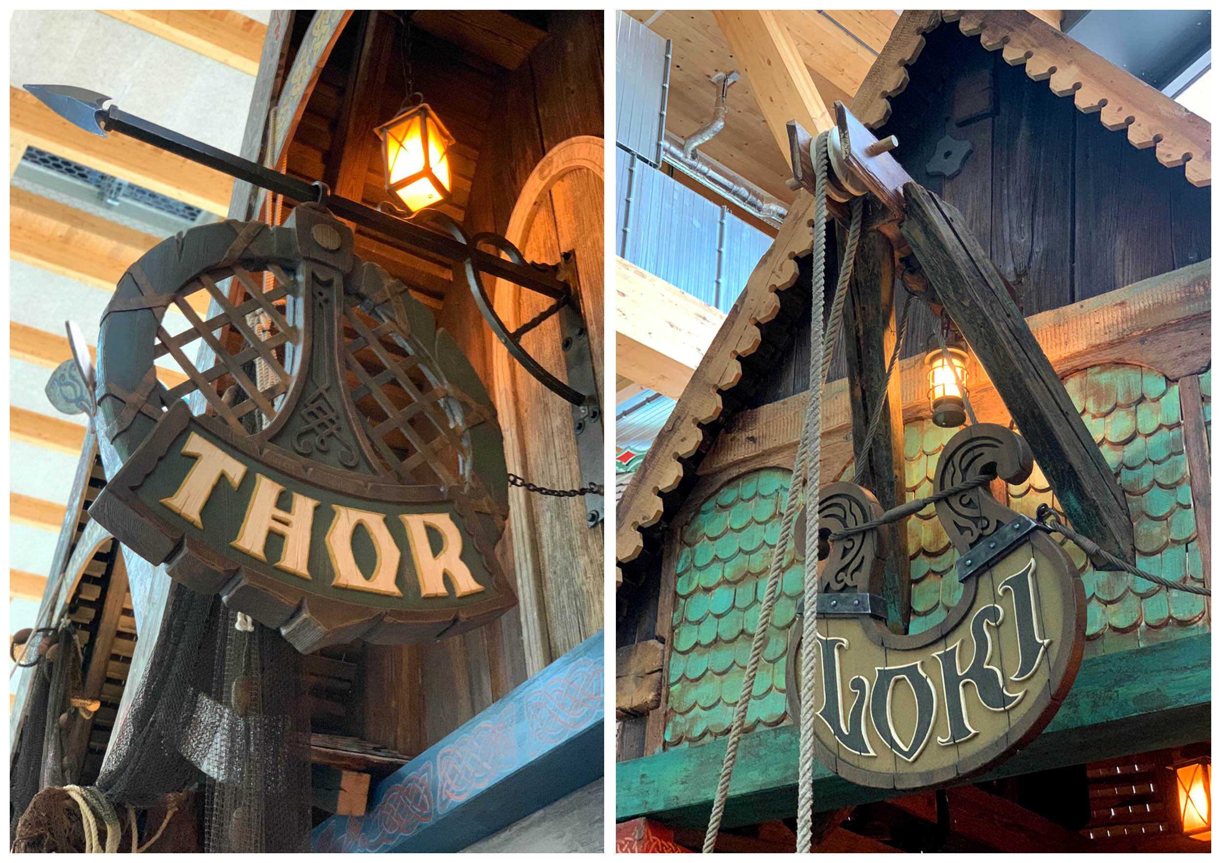
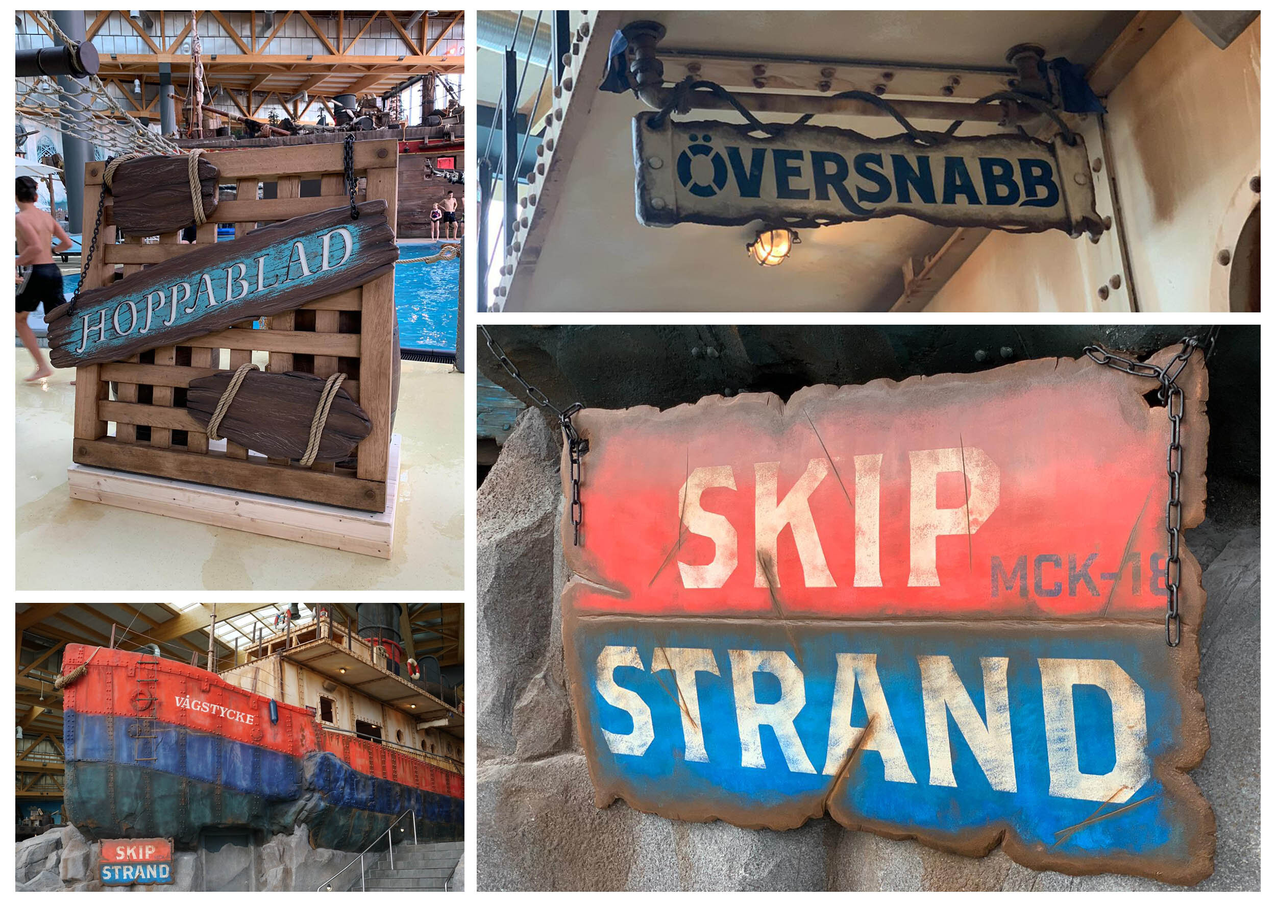
To make a significant impact the signage in the different areas should all have there own character. So the Viking town ‘Rangnakor’ is all made of forged iron, carved wood and ropes as this is what would have been available to the inhabitants. For an area such as ‘Trolldal’ which is a cartoony area of rocks and trees that transform into trolls, the approach was very different. This area needed to be very organic and that meant no human references, no nails or metal brackets hammered onto wood as this looks cruel when the tree itself is alive, so the signs are made of intertwining branches and organic shapes, to blend with the landscape – and painted in bright mushroom colors to embrace the charming character of the forest.
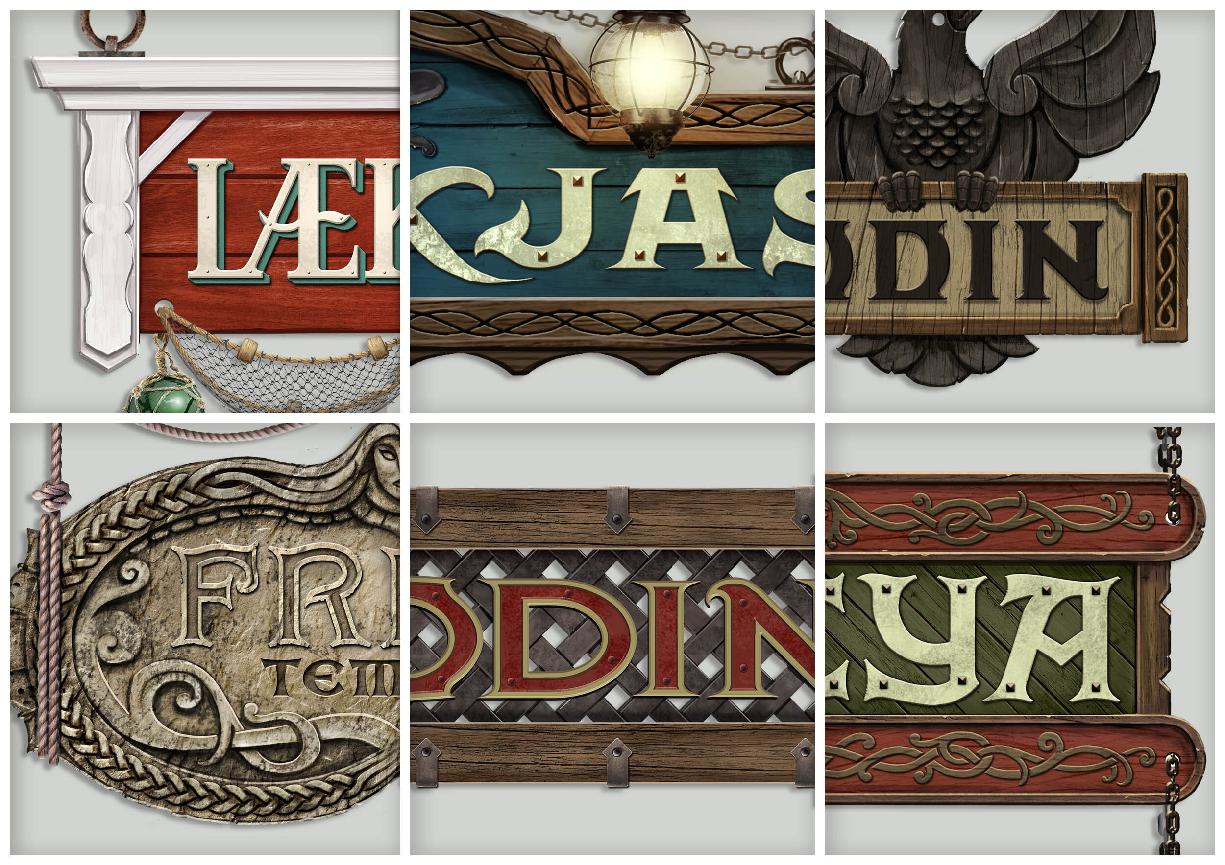
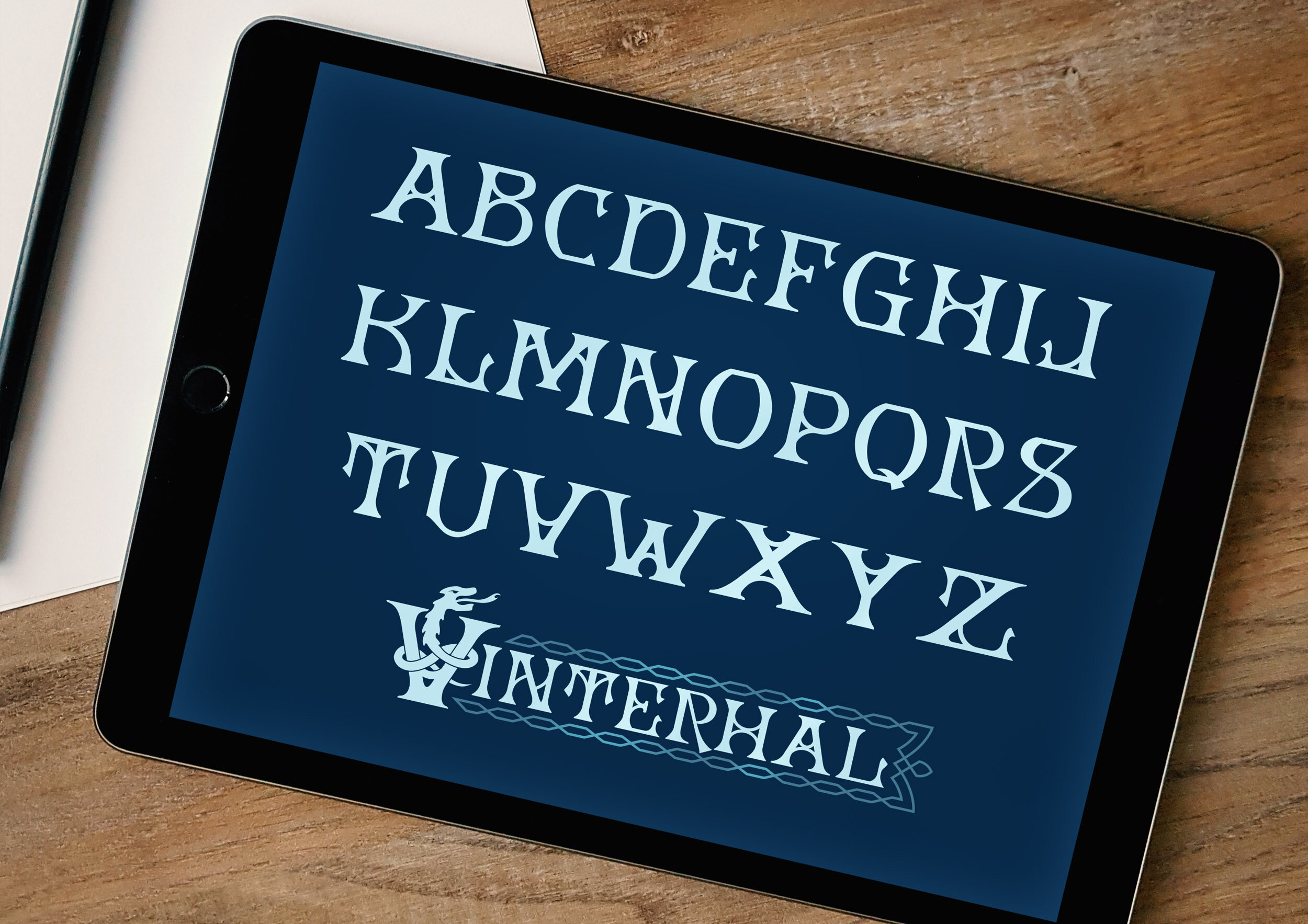
For A lot of signs custom lettering was needed to strengthen the story. What does the typography look like if vikings never had the Latin alphabet? As they worked with symbols and illustrations. And what kind of typography fits in a world made of trees and rocks? For ‘Vinterhal’, the ice palace, multiple signs had to made – therefore I created a custom font that was unique and fitted with the ornate architecture.
© Europa-Park