Eurosat Can Can Coaster
Paris 1900, the center of global influence and the pinnacle of scientific, educational and artistic institutions.
A time marked by optimism and affluence, ‘The Belle Époque’. The World Exposition was a place to exhibit the industrial progress and new forms of art were introduced to the public, most known was Art Nouveau.
Though this period is full of wonders and entertainment for the ‘nouveau riche’, the reality was that Paris still had a large economic underclass that lived in poverty.
To escape the tragic reality, people gathered in café-concerts or went to
music-halls, which were very popular and often infamous because of the extravagant shows and free-spirited atmosphere.
The Moulin Rouge is one of these places. A place of entertainment, frivolity and enchantment.
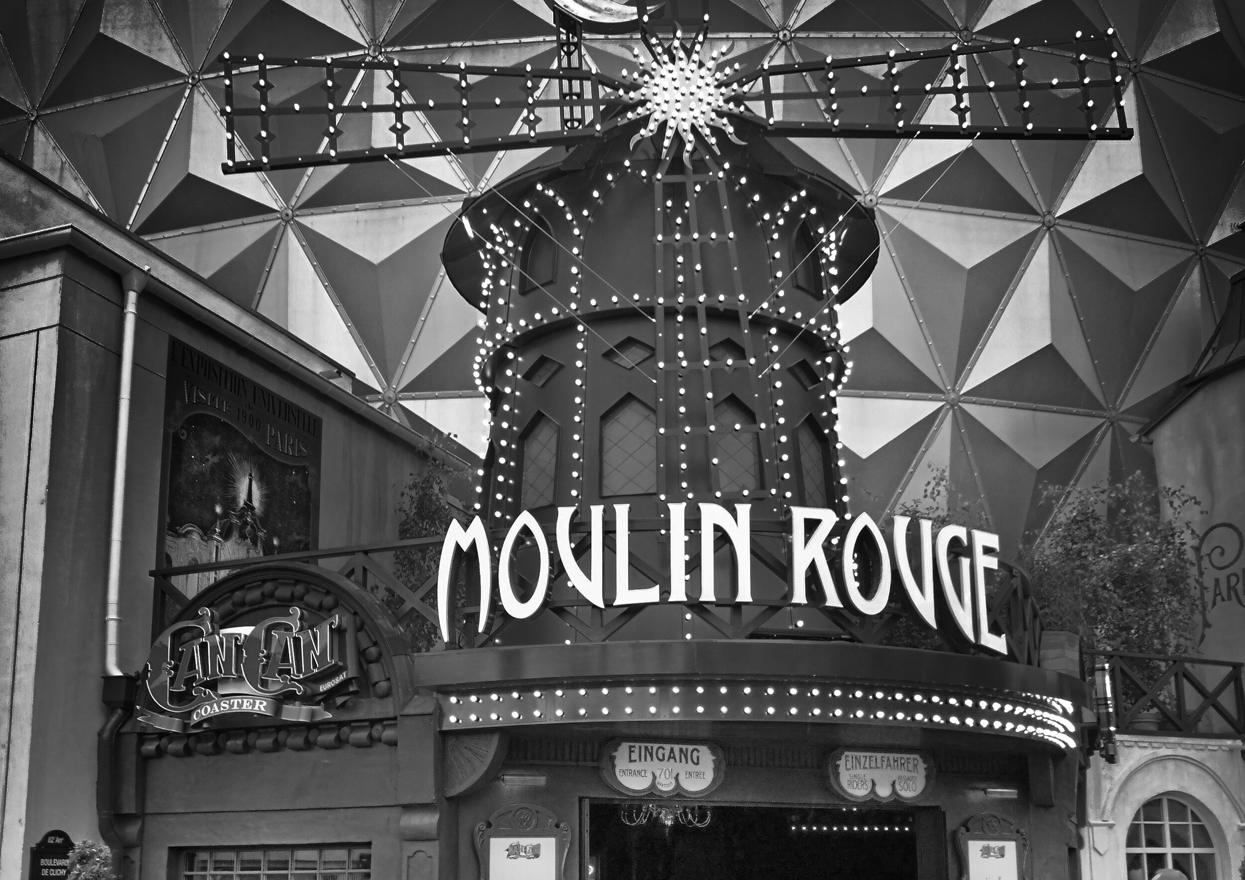
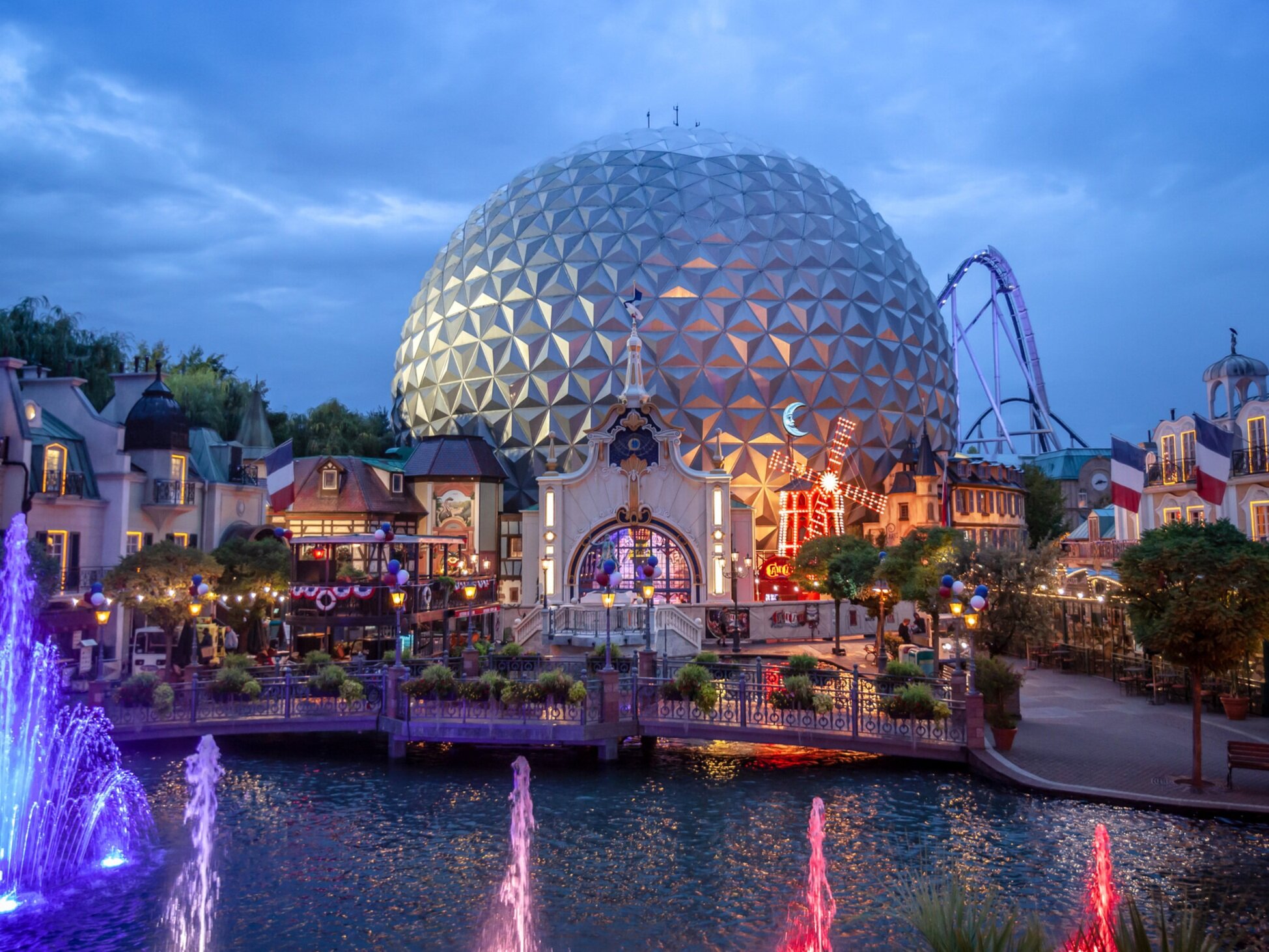
In 2018 the dark-ride coaster ‘Eurosat’ was rebranded to the ‘Eurosat Can Can Coaster’. Located in the French area of Europa-Park, this refurbished attraction would be themed after the famous Moulin Rouge in Paris – set in the streets of old Montmartre. I was asked to design all show set graphics and signages for the queue line.
To replicate an area or a building of a specific time period, all the details need to make sense and feel genuine. So when it comes to graphics and signage – details such as materials, color palettes, printing techniques and use of language are among the things to be considered.
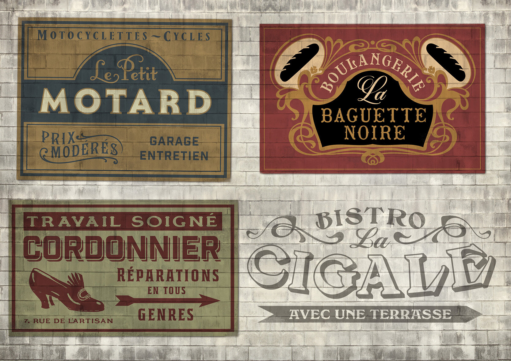
In search for reference I found out signs and typography were an important element in the street scenes of Montmartre. Big hand painted signs or fresco advertisements for a small cafe or a local artisan. All with the intention to be noticeable. Almost no wall was left unpainted.
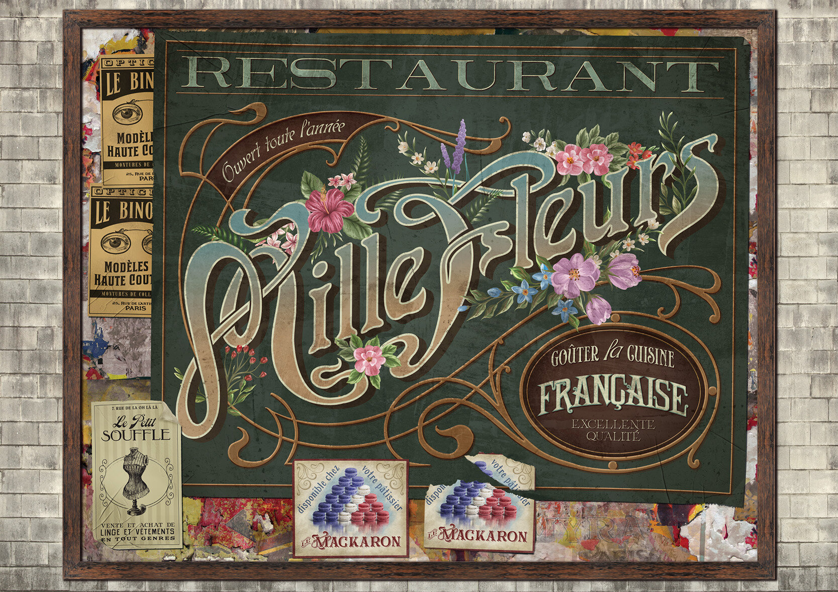
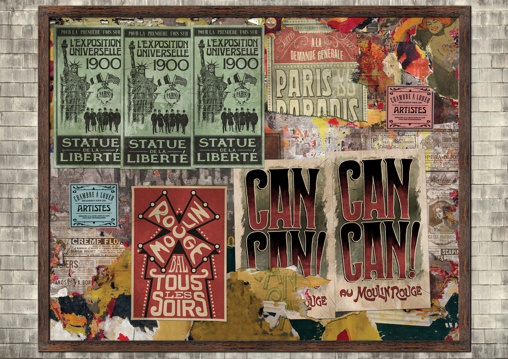
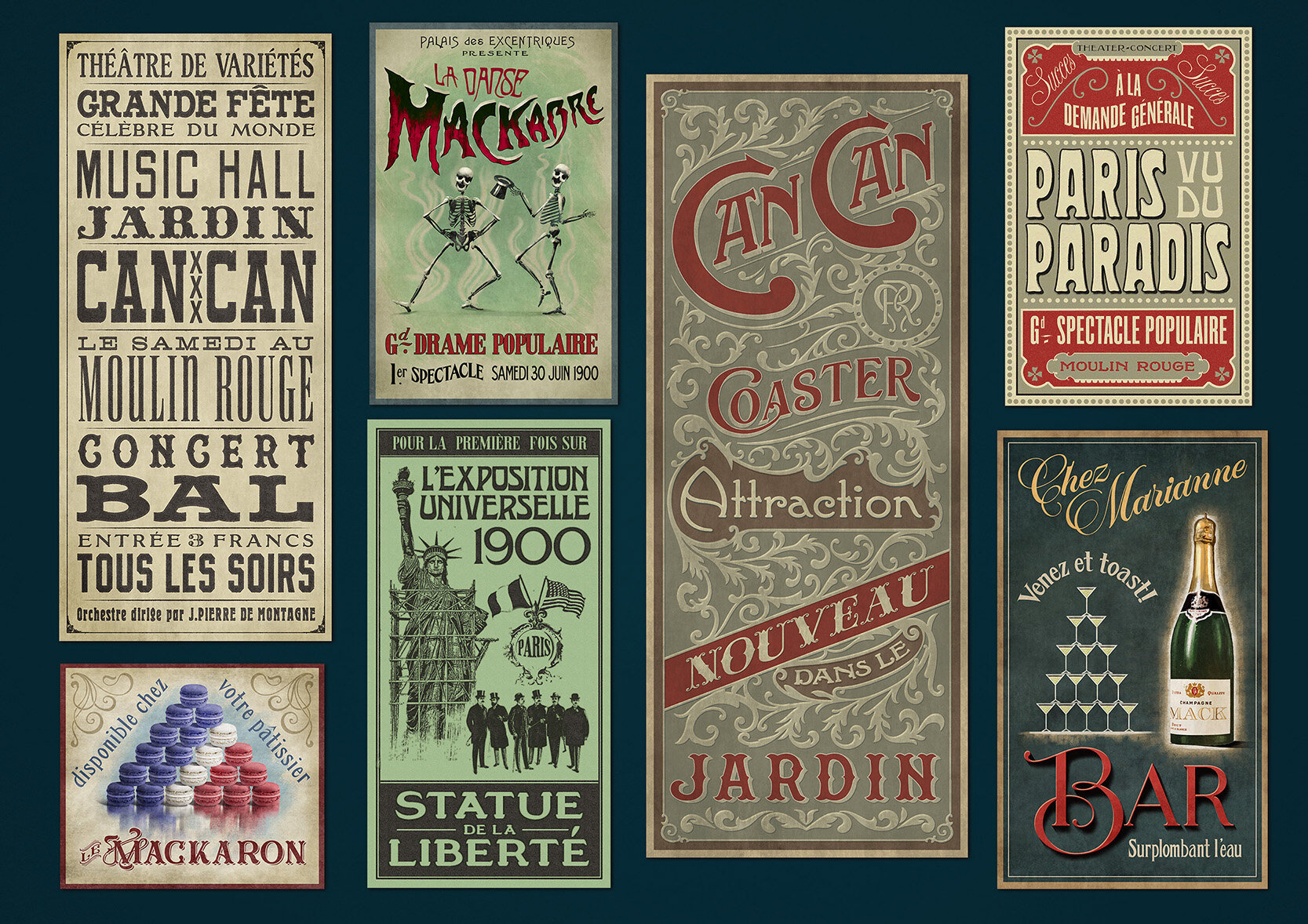
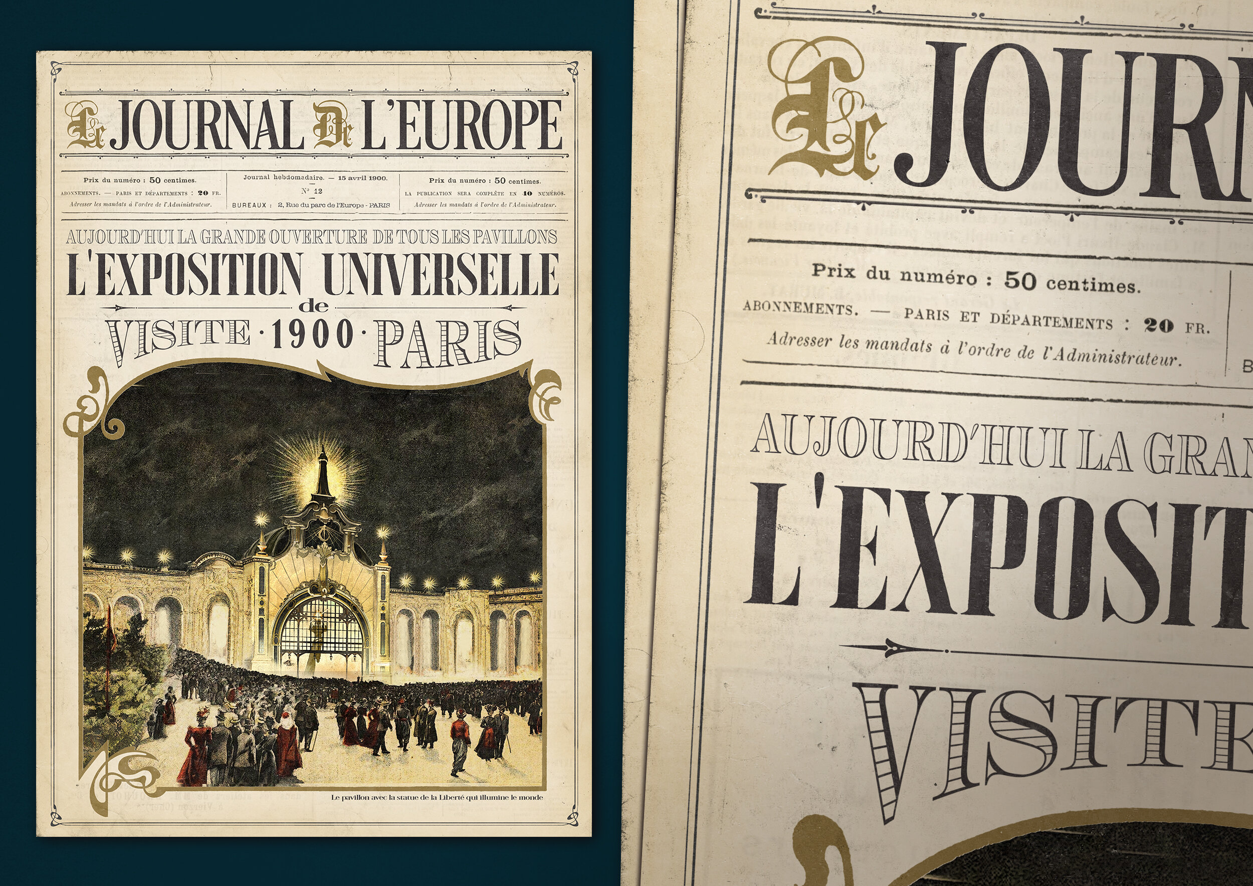
The queue takes you past different areas of Paris during the year 1900. At a certain point you enter the alleys of Montmartre. To establish the atmosphere I designed lots of 'eye wash' – a term used for (fictional) graphics that don't need to be noticed by the visitor, but do need to make sense in the story when seen from close by. For example there are painted wall graphics advertising fictional stores or posters for a new show at a theatre nearby. Some of these graphics do have a connection with another part in the park or they contribute to the story of the attraction. For example the ‘Mille Fleurs’ poster is a restaurant in the French area of the park – and during the year 1900 the World Exposition was held, so there is a lot of fictional ephemera for that as well.
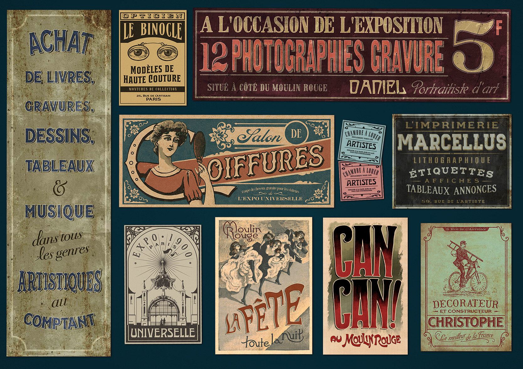
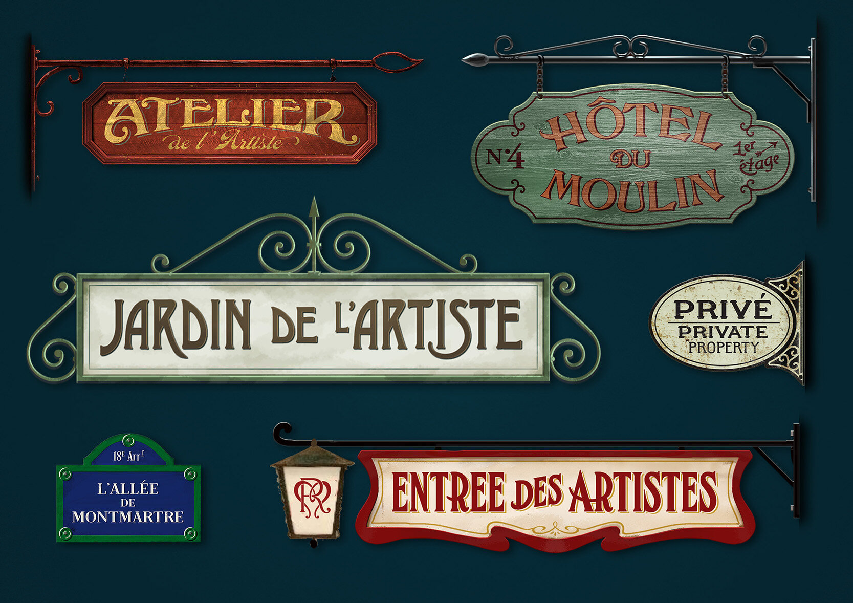
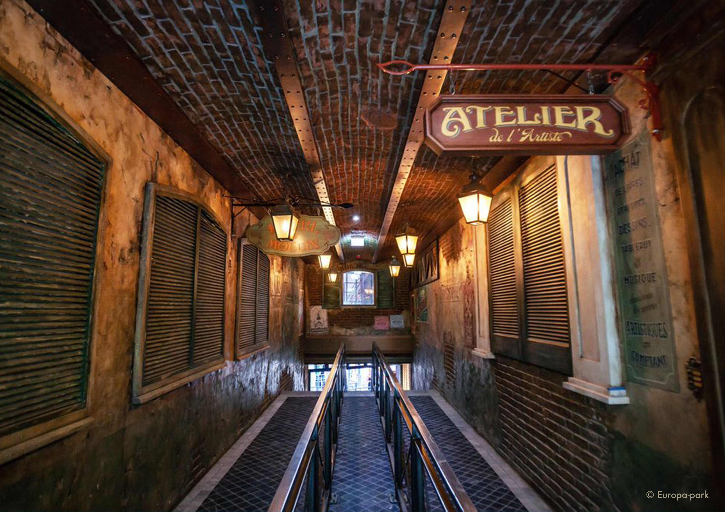
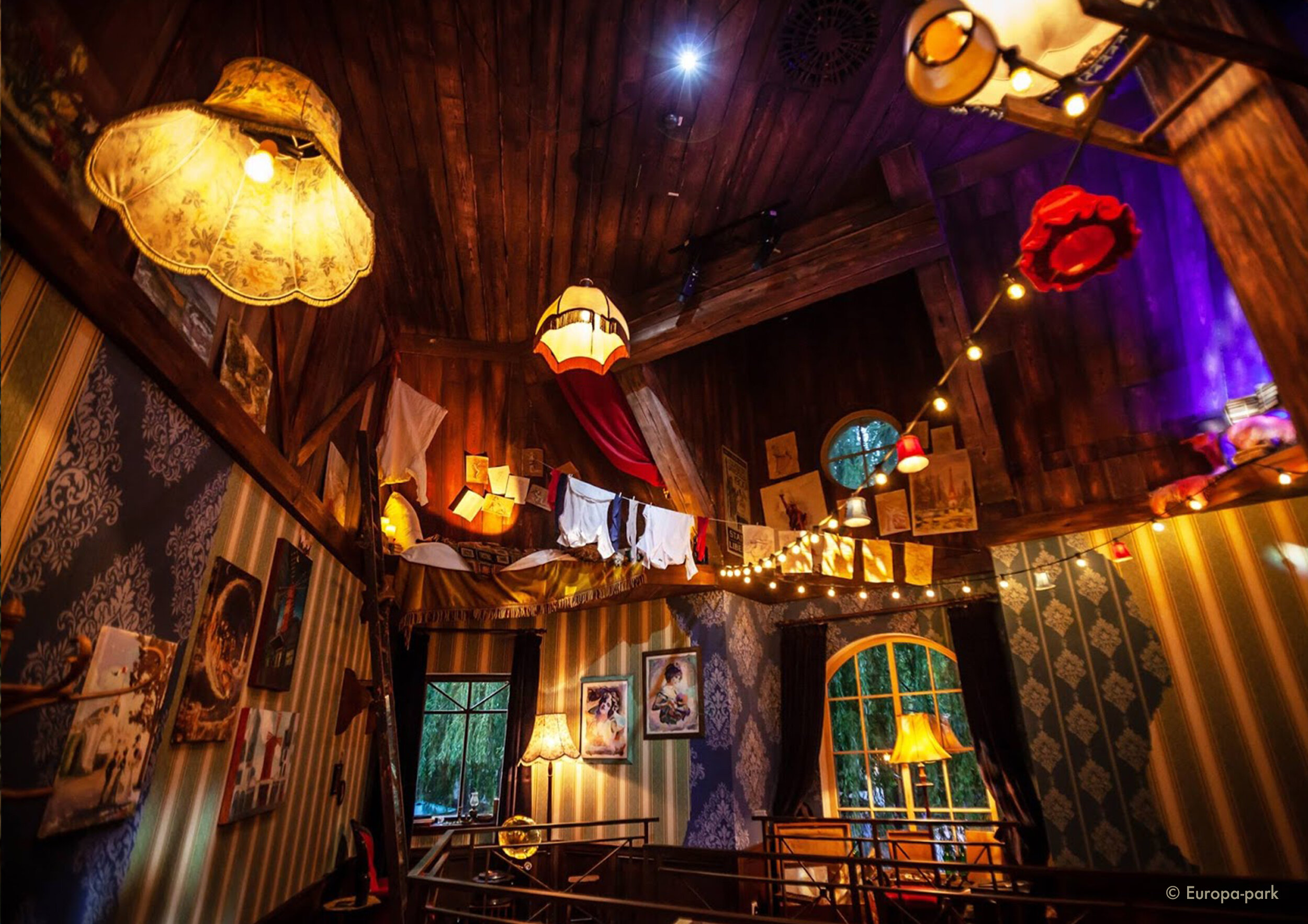
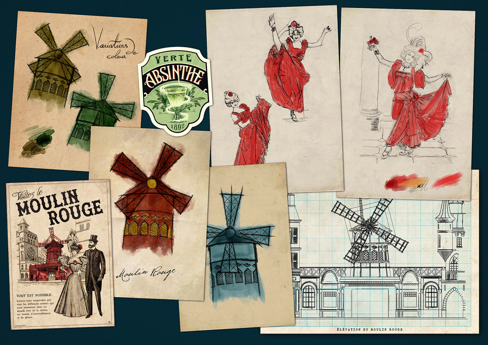
Because Montmartre was home to a number of famous artists, this subject needed to be displayed in the attraction. When you’re walking through the alleys of Montmartre you will see a sign of an ‘Atelier’ that leads you in to the Artists attic studio. Inside the guests can see all of the paintings and sketches the artist has been working on. It should feel as if he just left for coffee. The room is full with paintings of the Moulin Rouge and drawings of Can Can dancers, mostly painted with red, because of the artist's preference for that color. Some sketches also show how the Moulin Rouge became red after proposing different color variations.
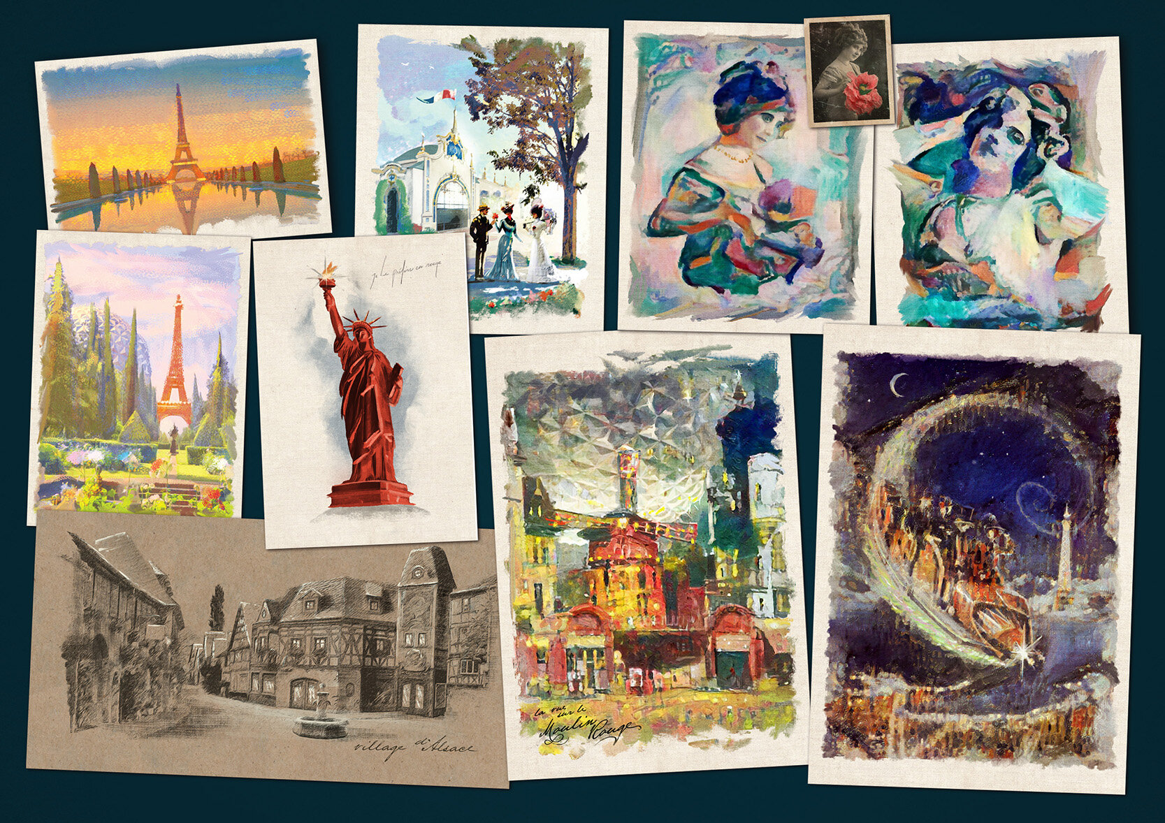
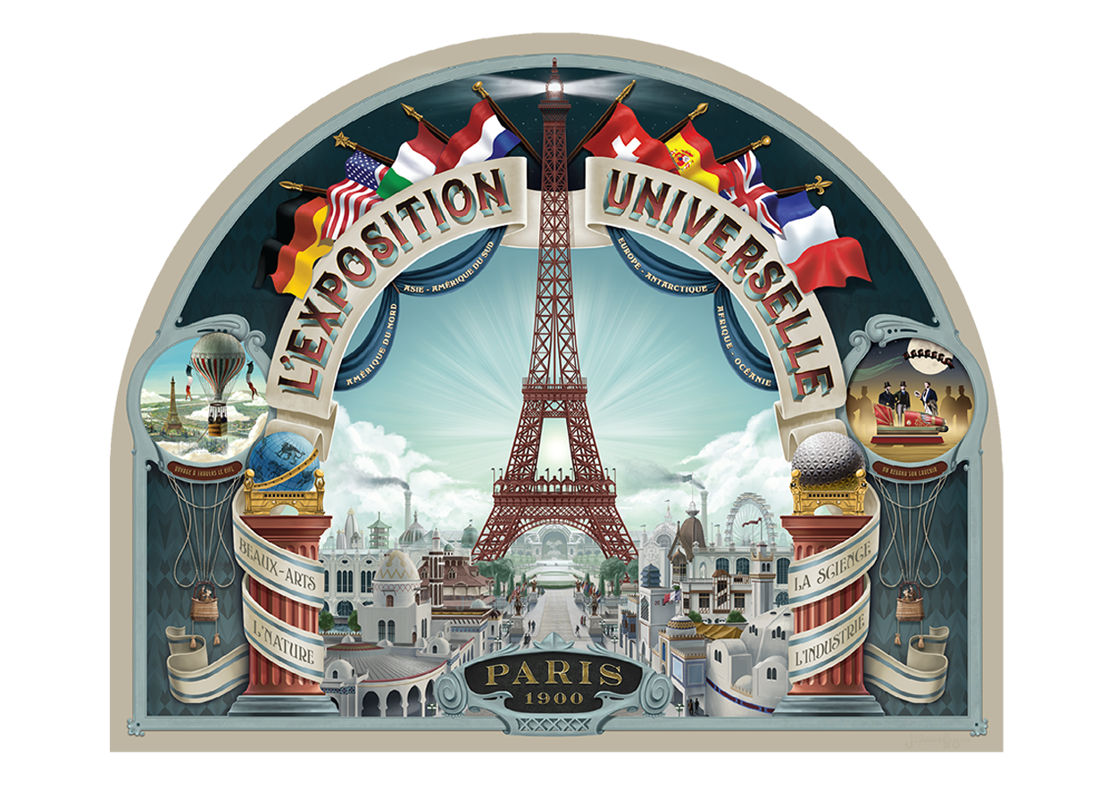
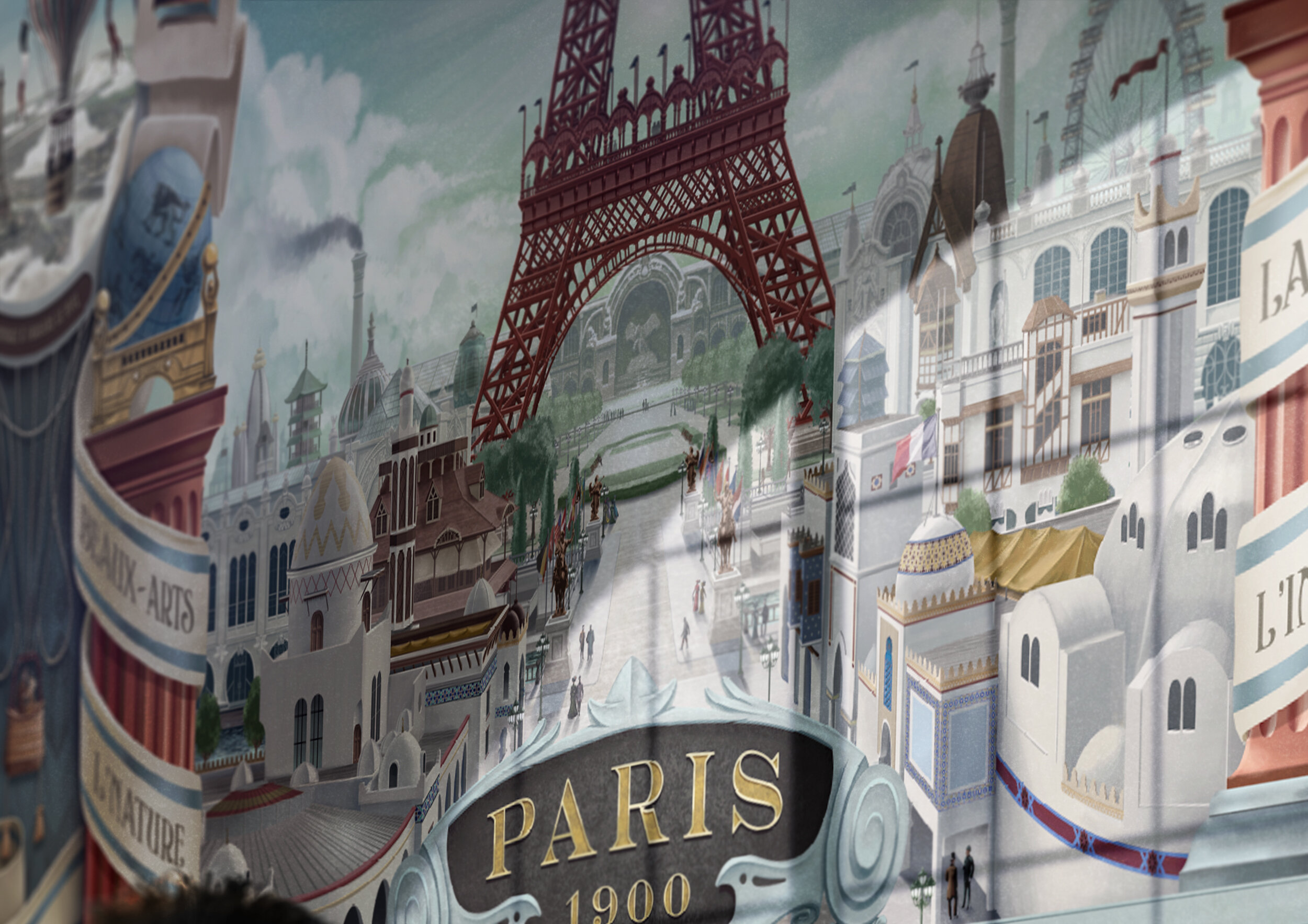
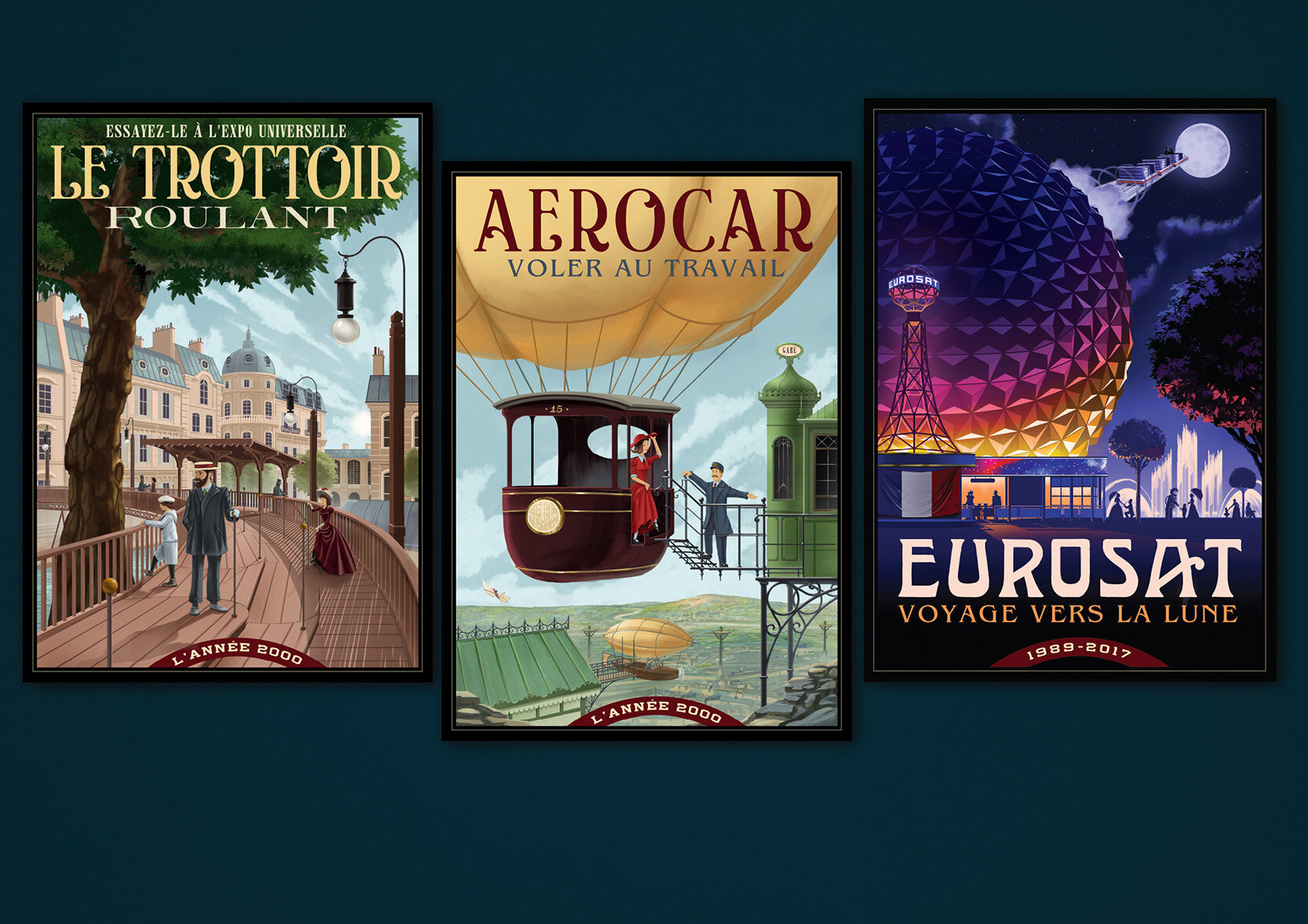
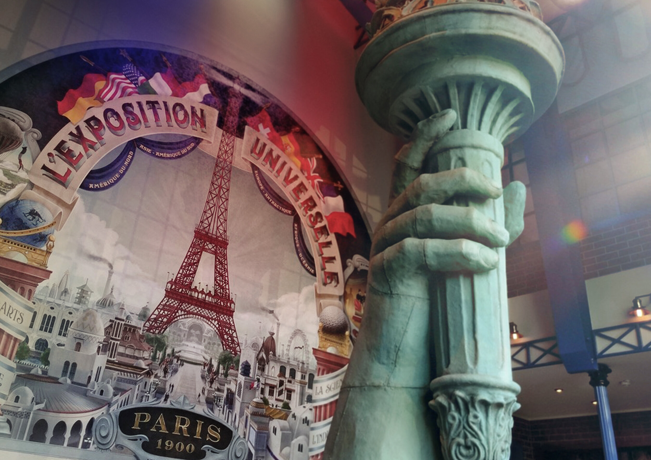
Because the ’l’Exposition Universelle’ was an important event of Paris in 1900, you will also visit one of the exhibits of the worlds fair. It showcases the torch of the ‘Statue of Liberty’. To complement the building and the statue I had to design a huge mural to be placed on the back wall of the room that can be seen through the ornate glass facade. The posters in this room are visions into the future from the year 2000. The ‘Moving sidewalk poster’ is based on an actual attraction that was build for the World Expo. The ‘Eurosat’ poster was an hommage to the old attraction.
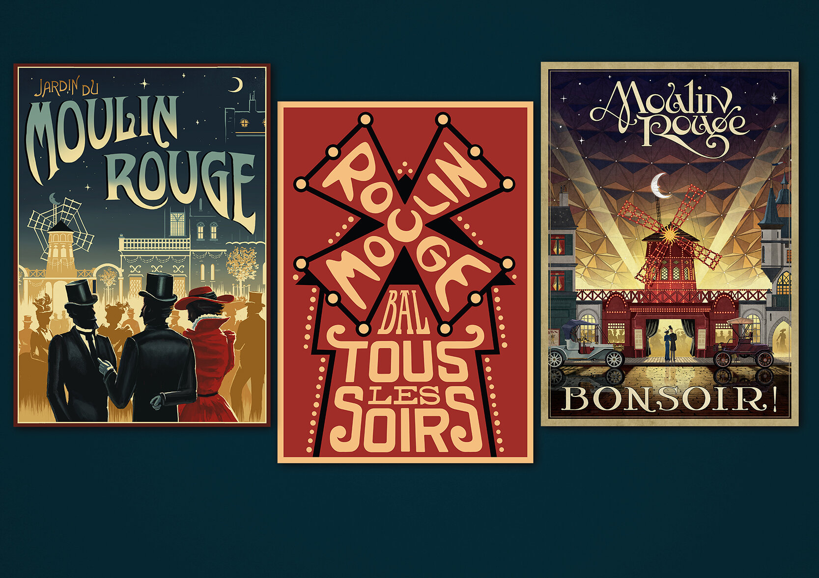
Probably the most famous graphic element of the ‘Moulin Rouge’ are the gorgeous (revolutionary) posters by artists like Jules Chéret and Henri de Toulouse-Lautrec. These original posters were used throughout the queue, but I was also able to design a couple ‘Moulin Rouge’ posters myself and tried to capture just a glimpse of the quality and zeitgeist of these artists.
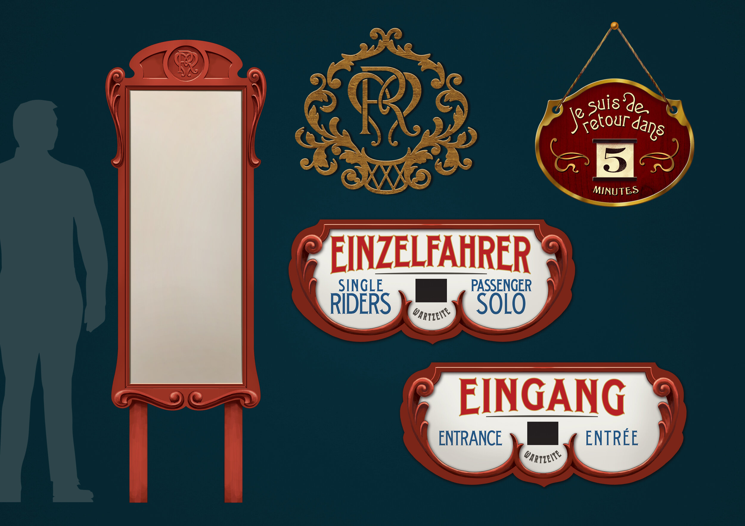
As you walk through the queue you enter the backstage entrance of the ‘Moulin Rouge’. Because it’s set in the Moulin’s ‘Great Period’, it would make no sense to make the “public” side of the theater look weathered and old. That’s why a more vibrant and ornate style was chosen for the signage, to really show the glory and extravagant atmosphere of that time.
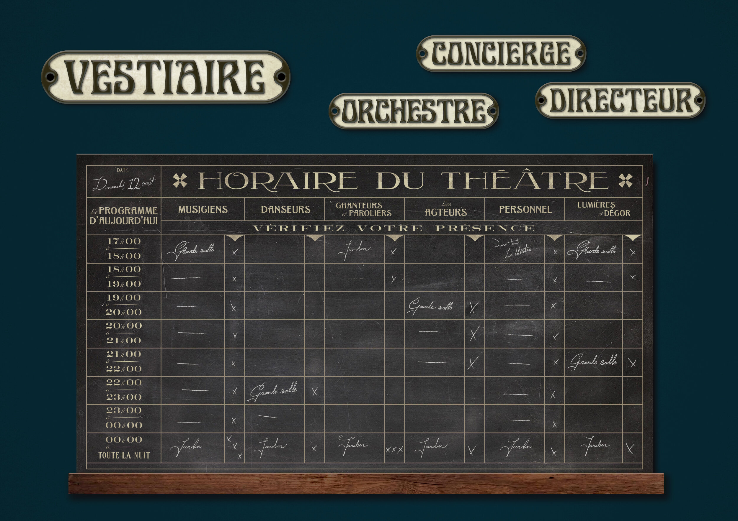
”Backstage” a more timeworn and modest style was chosen for the graphics, because it is backstage and therefore it doesn’t need the glamour. It should still feel like you’re in the 'Moulin Rouge’ – elegant, but more functional and formal. A place were artists and staff prepare to get on stage.
For example below you see enamel door plaques to show the different dressing rooms. You’ll also see a fictional time schedule for the staff for that evening. It has a lot of detail showing when and where the musicians should be and if they are present – and from midnight on everybody gathers at the ‘Jardin’ to party “tout la nuit!”. The signs and graphics are made for guests to discover and to give a little bit of extra depth to the story of the ride.
Working on this project really was challenging and I think the most satisfying to design so far, I learned a lot. Seeing the project all together is amazing and I’m proud to have contributed to this wonderful addition to the park. It was great to work together with the amazing team of Mack Solutions on this project – they did an incredible job bringing the signage to life. If you want to see more of the attraction I really recommend visiting Europa-Park!
© Europa-Park


